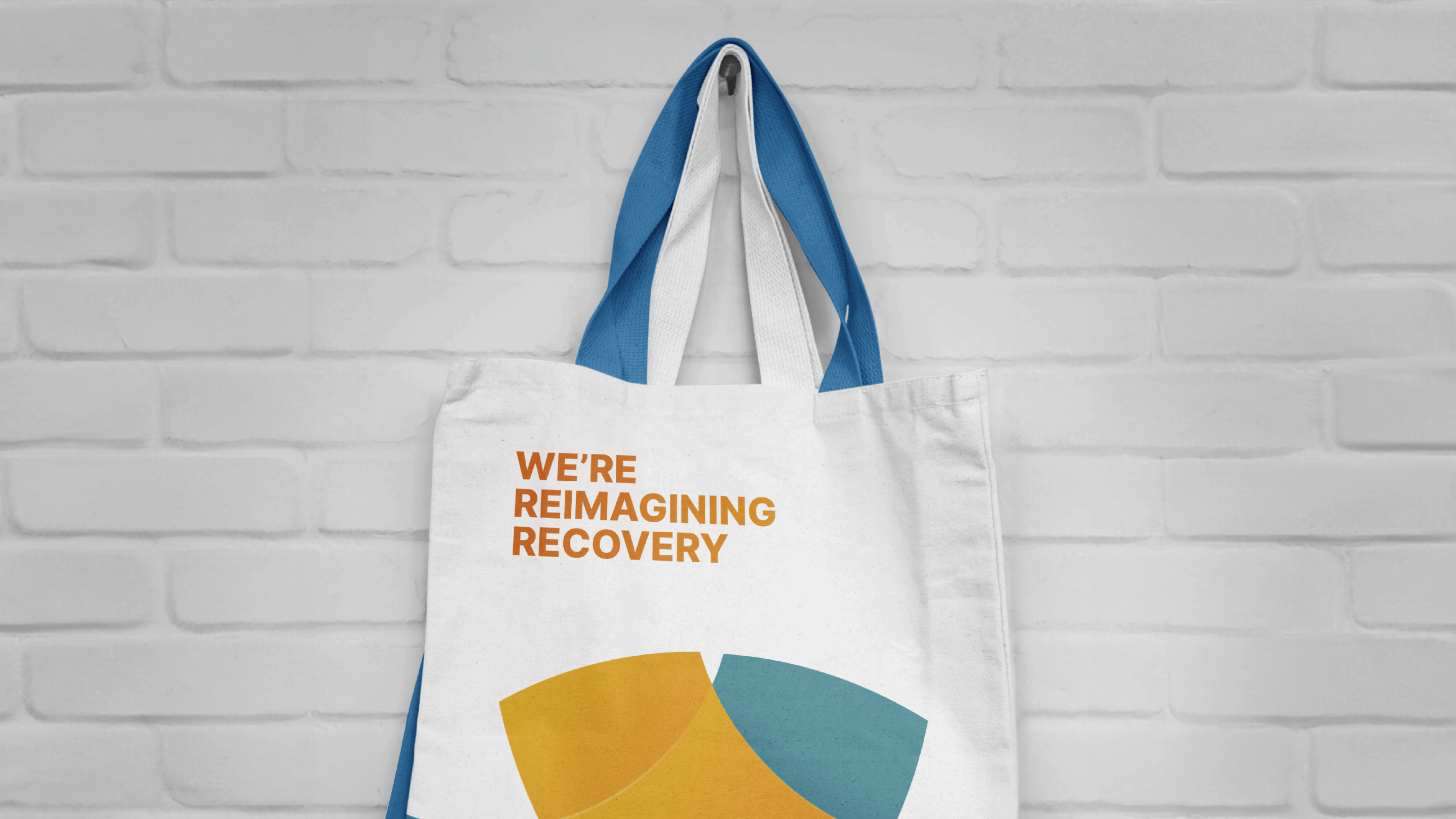
The branding project for Refocus Recovery, a community organization dedicated to building a strong recovery support network, involved crafting a compelling identity that reflects their mission. The design highlights their partnerships and commitment to peer recovery, while emphasizing their role in training and certifying peer recovery specialists.





Refocus Recovery
The rebranding for Refocus Recovery, a community organization committed to enhancing support networks for recovery, was designed to create a distinctive and impactful presence. Refocus Recovery collaborates with local organizations to offer peer recovery support and train individuals to become certified Peer Recovery Specialists. The rebranding significantly boosted their visibility and communication of their mission.
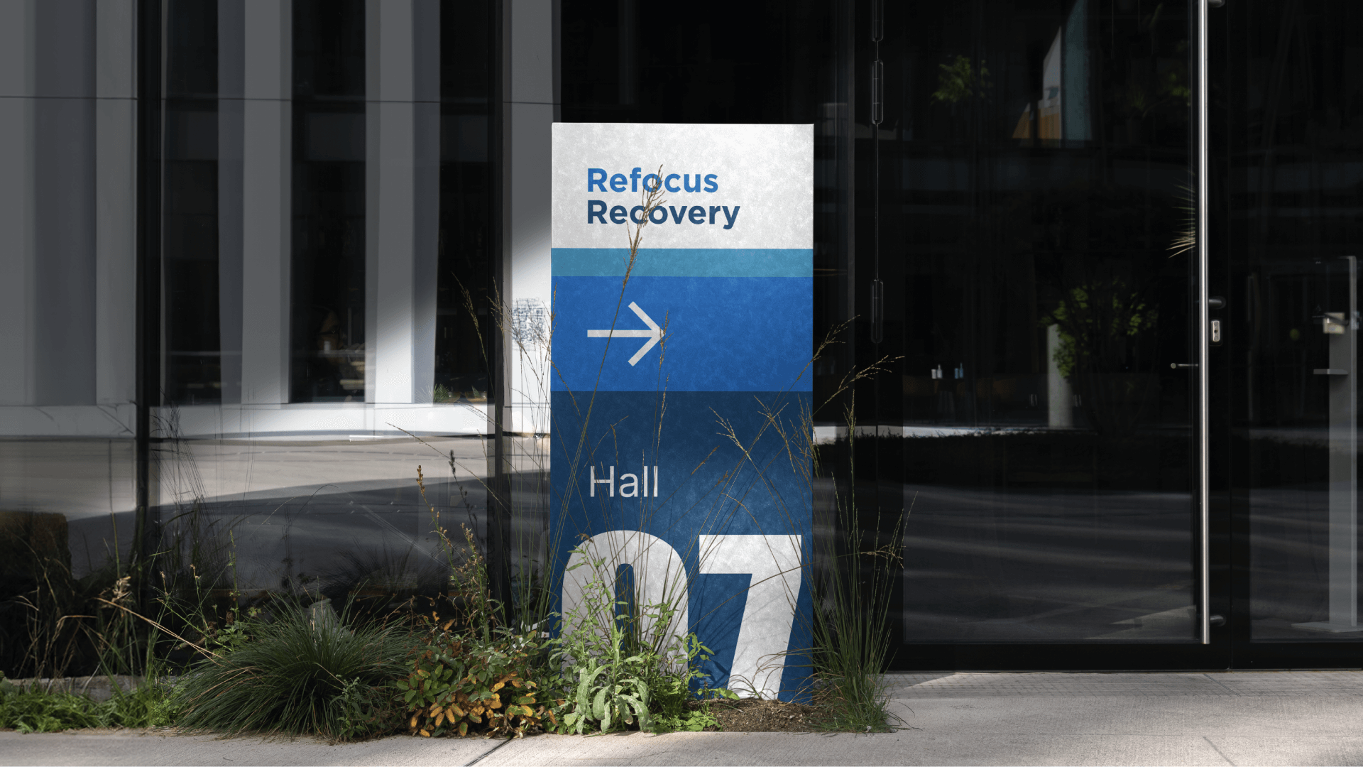
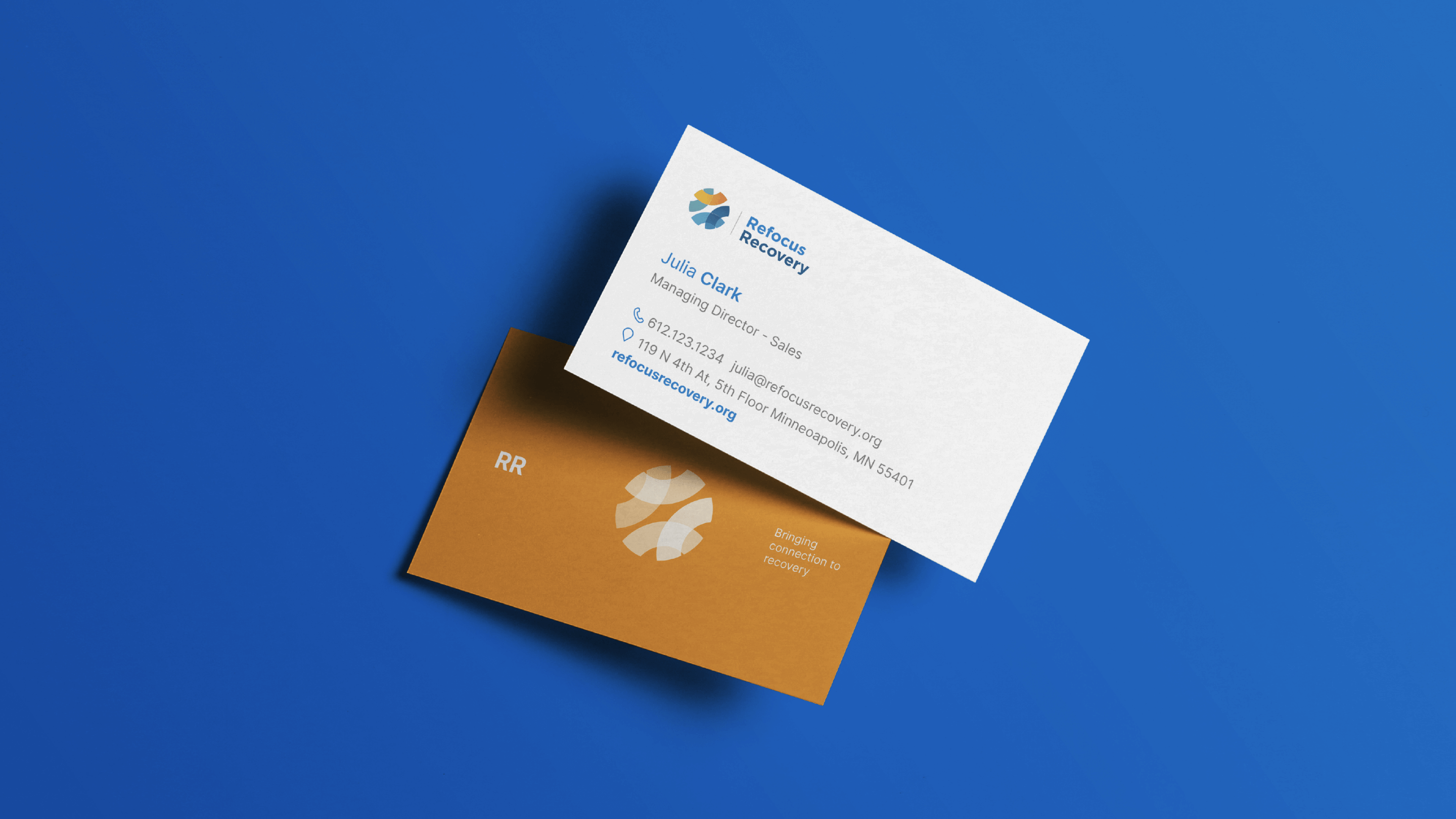
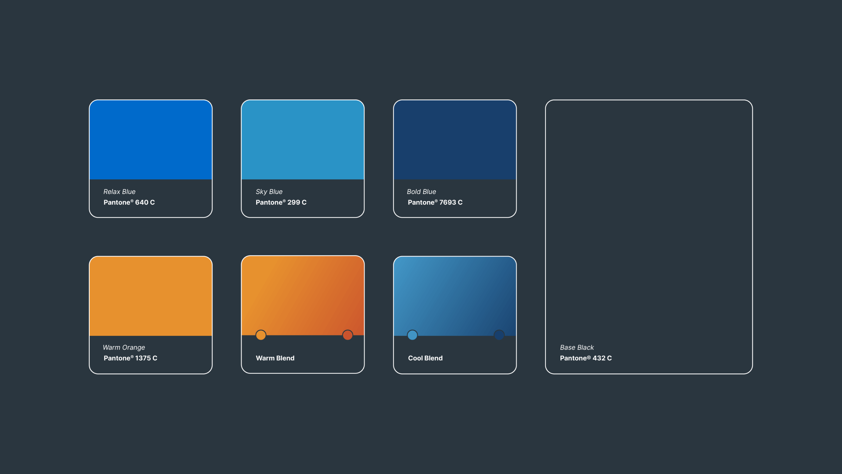
Prior to the rebranding, Refocus Recovery struggled to stand out in a competitive landscape, despite its valuable services. The refreshed visual identity, including a new logo, updated color palette, and refined typography, effectively conveyed the organization’s core values of trust, compassion, and professionalism. This new branding resonated strongly with their target audience and enhanced their overall market presence.
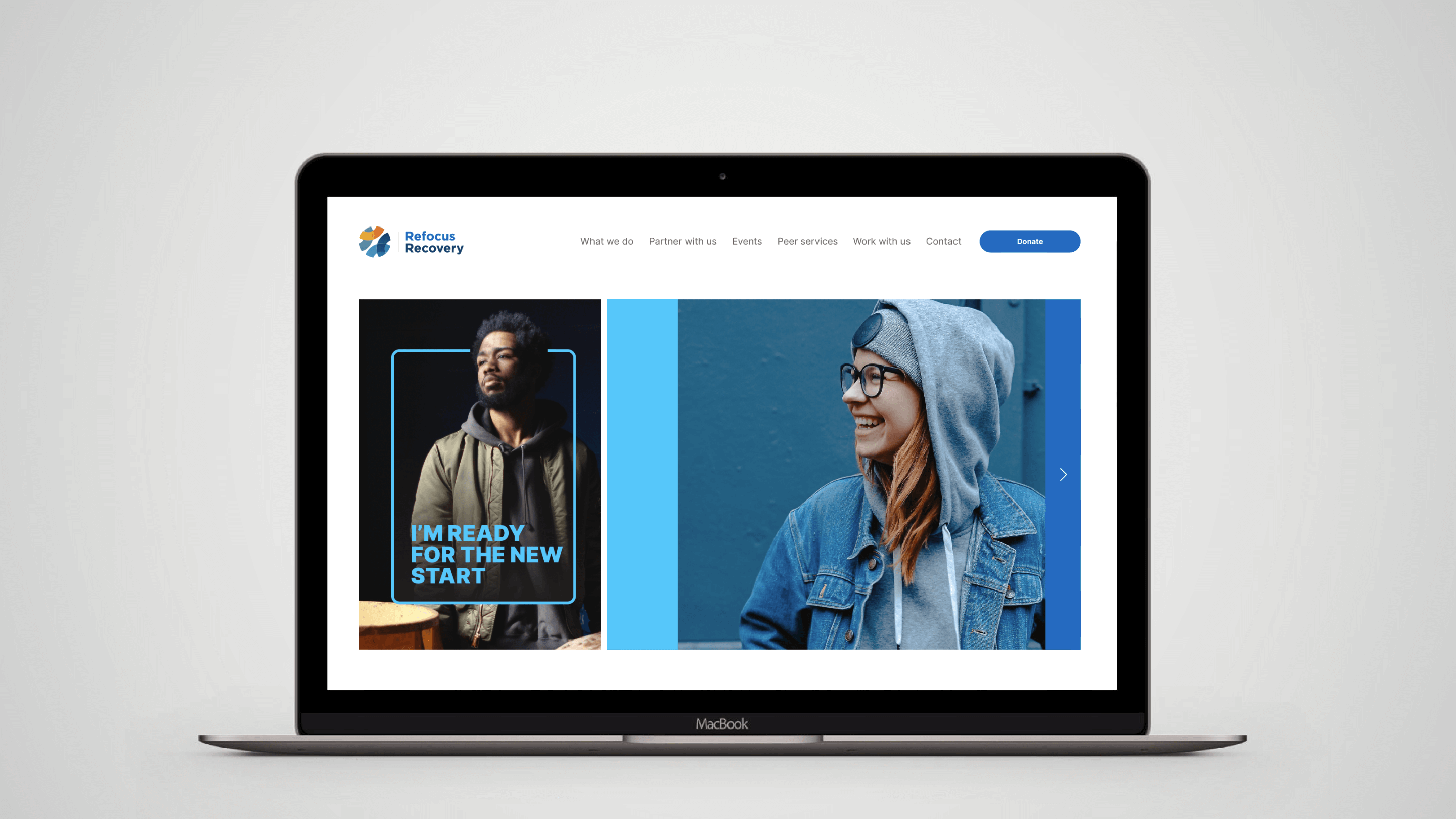
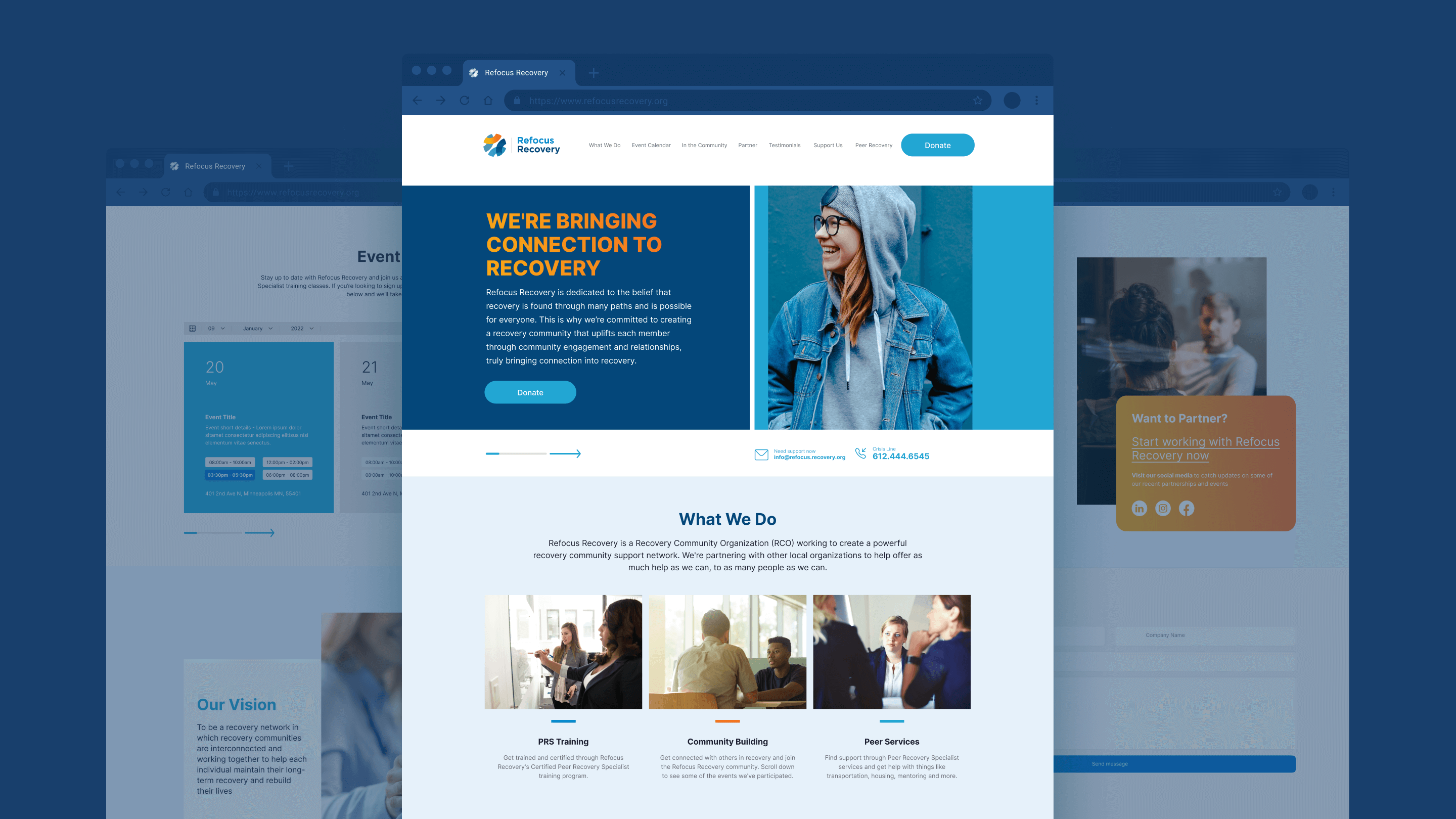
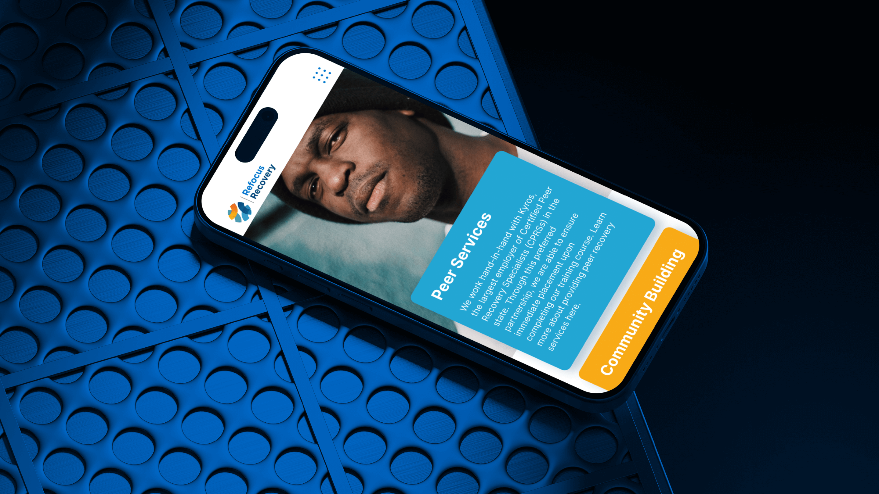
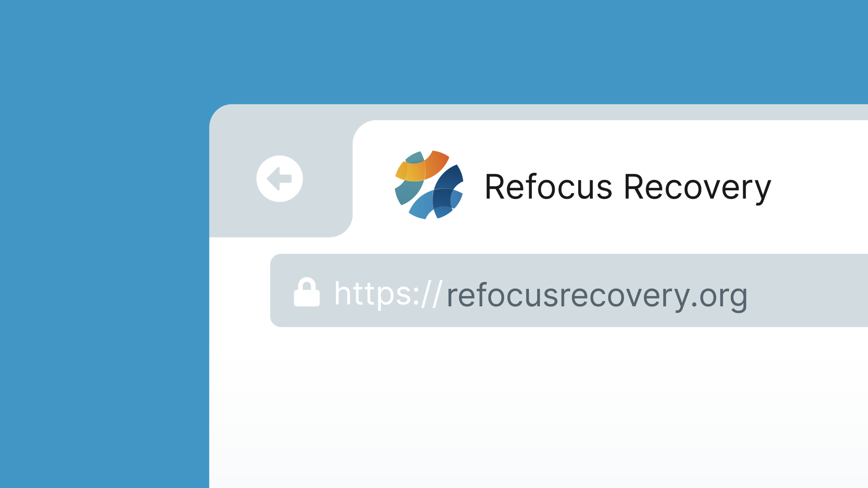
The comprehensive brand guidelines ensured that the updated visual identity was consistently applied across all touchpoints. The redesigned website became a more engaging and user-friendly platform, highlighting the organization’s services, partnerships, and success stories in a compelling way. This improvement in web presence led to increased user engagement and better communication of their offerings.
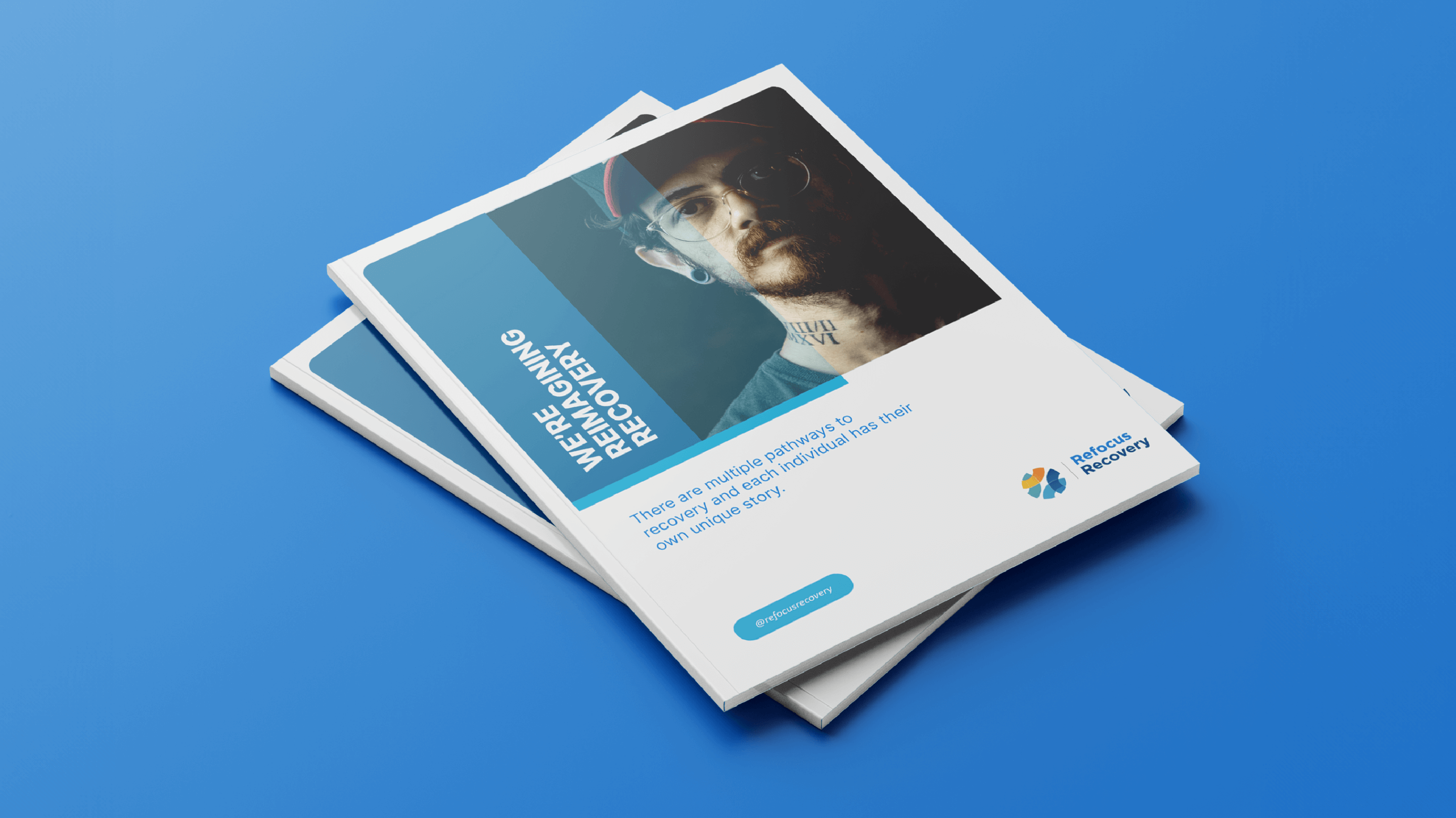
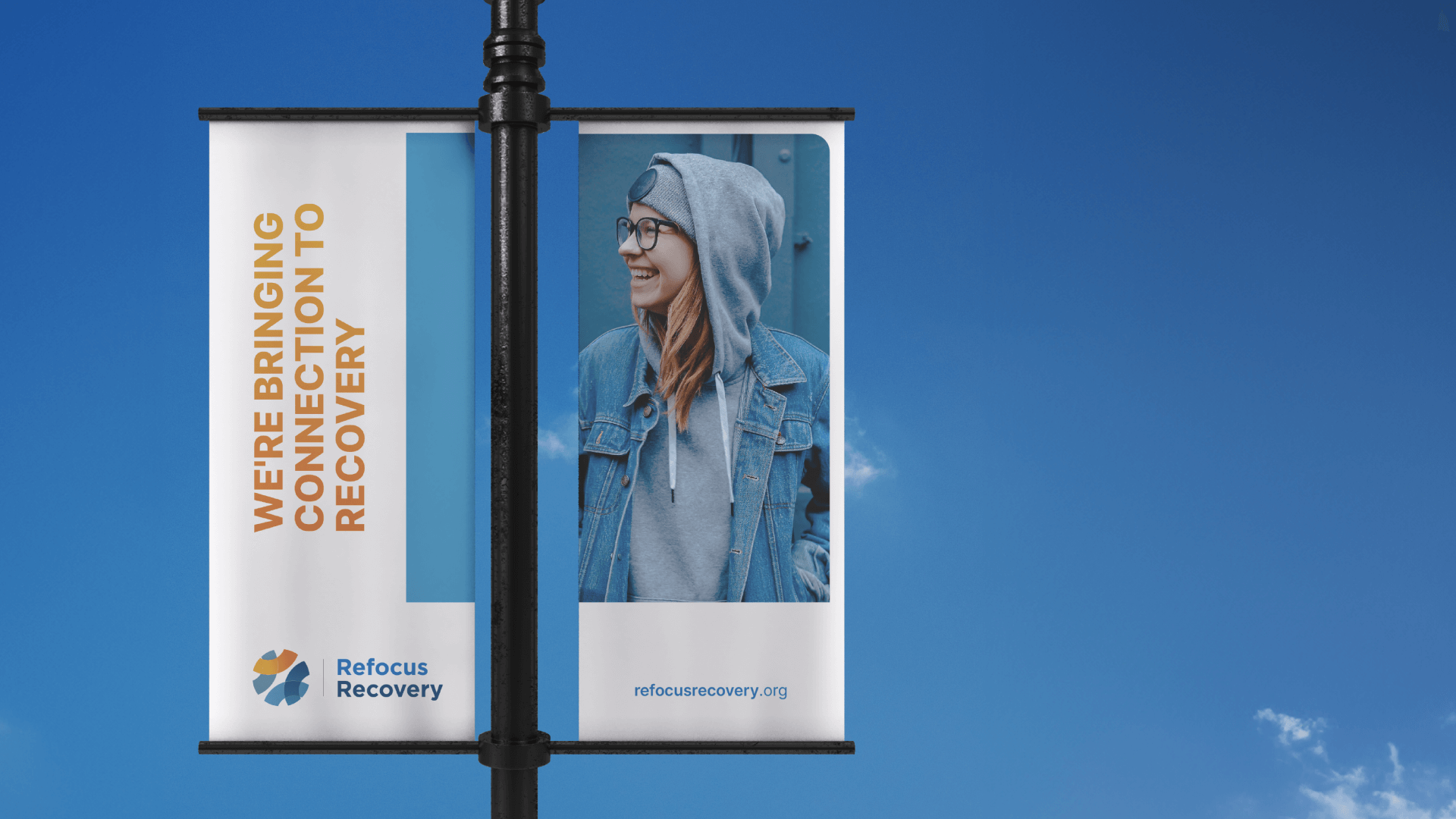
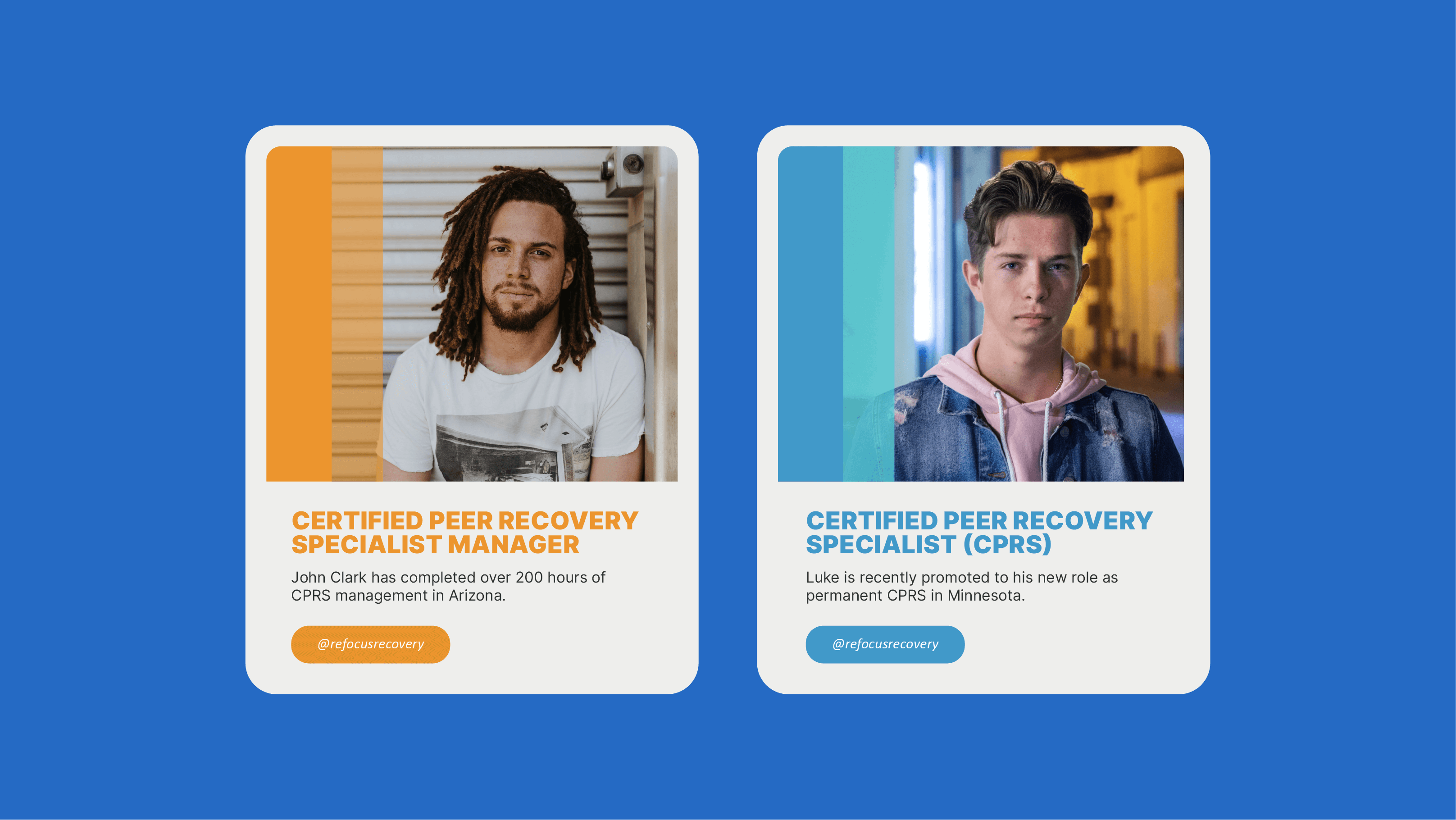
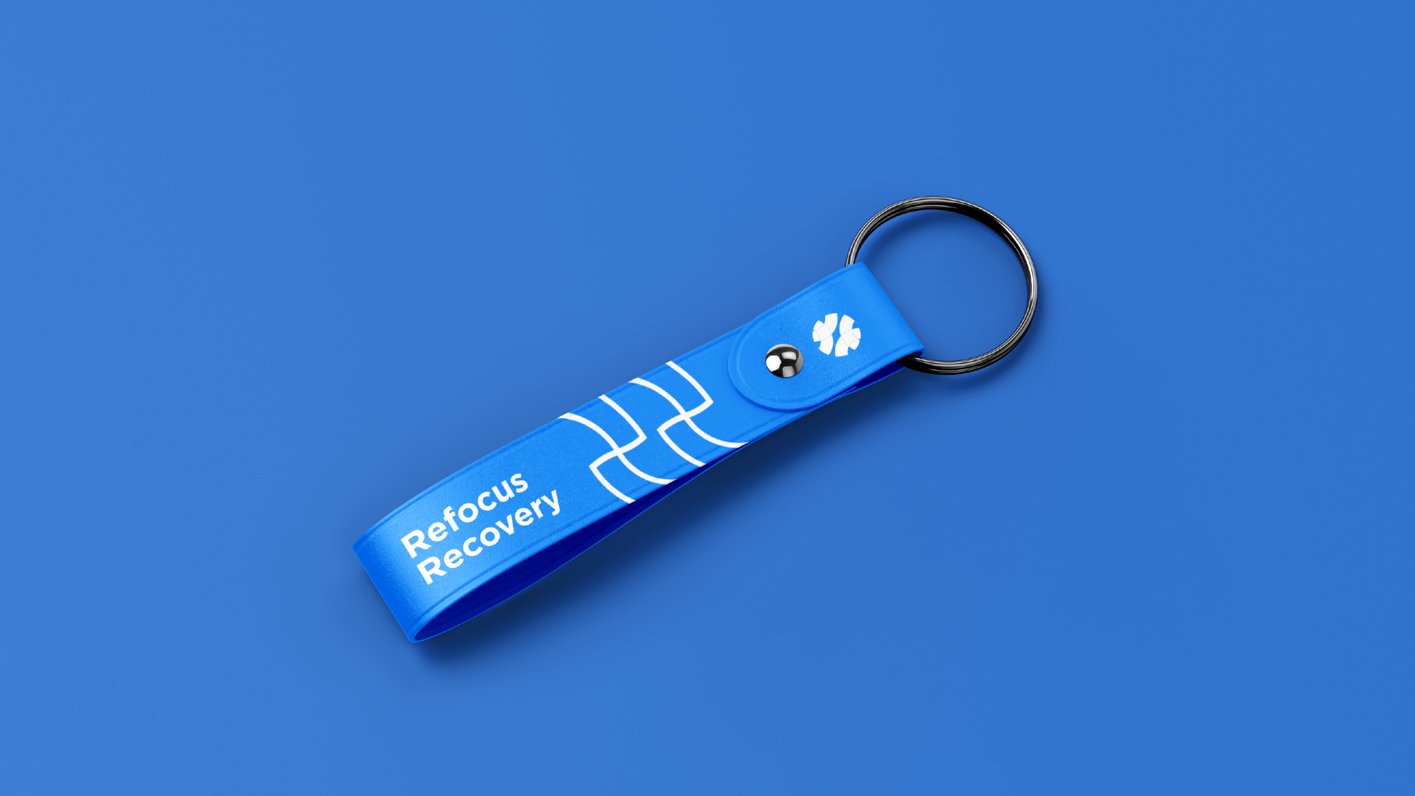
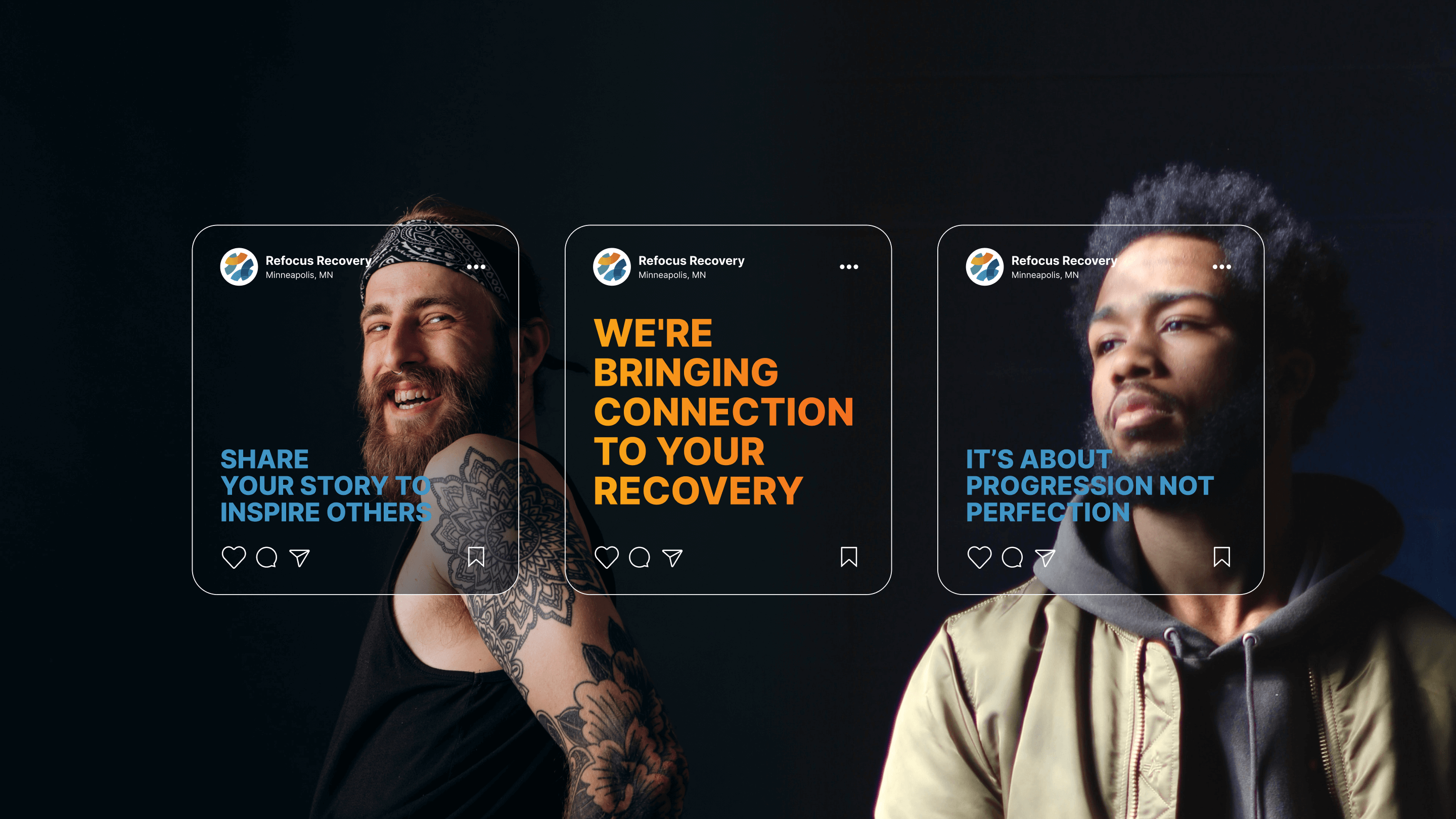
The revamped social media kit, featuring new branded graphics and templates, significantly enhanced online outreach and engagement. Marketing materials such as brochures, flyers, and posters also saw improved effectiveness in promoting Refocus Recovery’s initiatives and events.
Overall, the rebranding project greatly increased Refocus Recovery’s visibility and credibility within the recovery community. The cohesive and professional brand identity not only set the organization apart from its competitors but also solidified its role as a key resource in peer recovery support. The successful rebrand led to greater recognition and support for their mission.
